This is the first installment in the longer development of an app!
The Problem
Now that the snow is melting, potholes are appearing in the streets and alleys all over the cities. Unfortunately, it’s difficult to let anyone know about these, because it is difficult to describe their location or severity, and the average person isn’t quite sure how to get in touch with the people who should fix the potholes, or even figure out who’s responsible for a particular street. The same is true for other broken things: a bike rack that was bent by a snow plow or a fence hit by a car are easily noticed by a resident, but not easily found and repaired by the relevant city, county or business that maintains the property.
The goal of this app is multi-fold. From a citizen perspective, allow quick and efficient reporting of issues, and allow searching and tracking of reported issues for interested citizens. From a responsible party role, to provide the ability to collect, categorize and prioritize reported issues. And lastly, for those performing the repairs to easily find and fix the reported broken item. There is an additional layer of complexity here in that any geographical data is difficult to display in a meaningful way that isn’t overwhelming. One of my goals in this app is to avoid views that are visually overwhelming, and to avoid asking users to provide information through extra steps in the process.
Users
Initially, I broke the users of this app into three groups: citizens, administrators and repair crews. Within citizens, the primary user group for the purpose of the first user flow are individuals reporting problems. There are a few other interesting groups to consider, such as activists interested in tracking reports and completion progress and community organizers aiming to improve a particular area.
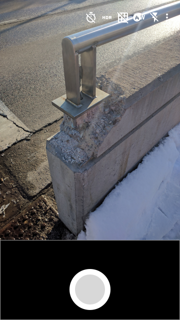
This first interaction follows the submission of a report about a broken guardrail. An interactive prototype of the flow can be found here!
Submission Flow
The goal of this flow is for a citizen to submit a report about something broken, so it starts with a camera and review.
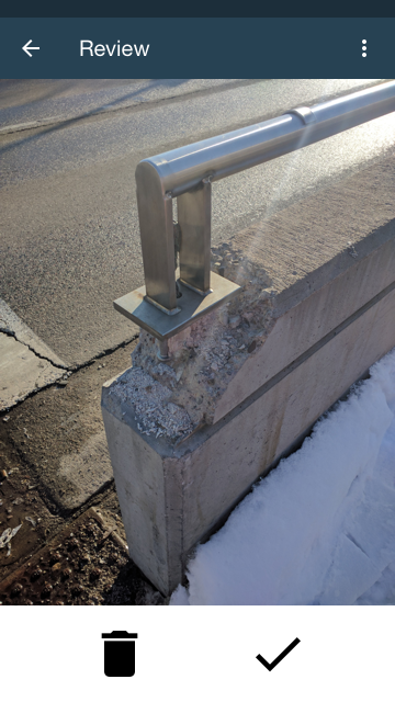
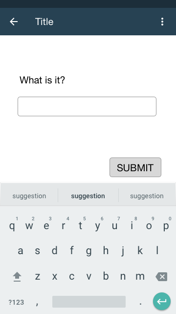
Then the app walks the user through steps to add details about the reported broken item. Rather than asking the user to provide a location, whether typed or chosen from a map, the app will pull GPS data at the time the photo is taken to log the report. This simplifies the steps that are required to submit a report, and increases the likelihood that a user will complete the submission. The app asks for a title first.
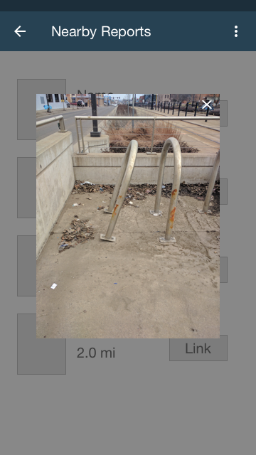
Then the user is prompted to review a list of nearby reports to see if any are about the same broken object as the current report. The user is able to click on an image for more detail or indicate that none of these are the same as the object they are reporting.
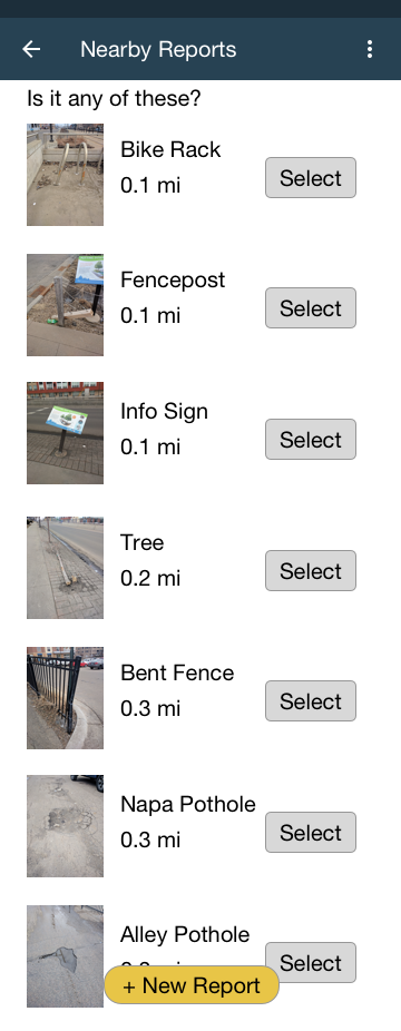
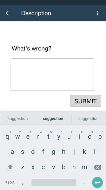
Since in this example no existing reports are about this same broken object, the user is prompted for a description.
After submission, the user is taken to a detail view of the submitted report, with the ability to add photos or details.
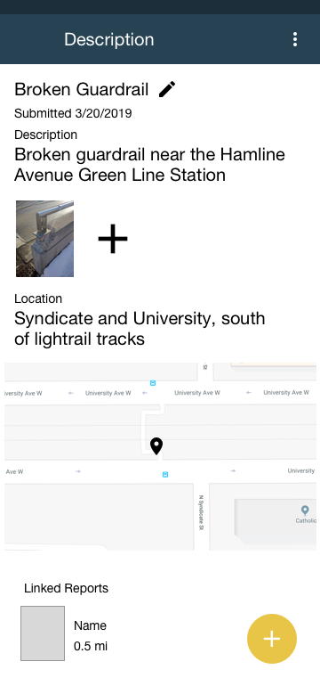
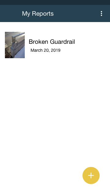
The user can also see a list of all reports that they have submitted.
At this point, the user has successfully submitted a report! In the first iteration of the app, I simplified the submission steps after building a long form-entry style screen to collect details about the broken item. Cutting the submission process down to five steps on separate screens makes the process pretty short and simple for mobile users who are not going to devote a lot of time to filling out information. This change was made after I created an interactive prototype in Sketch and played around with it. I also originally gave the option to add more photos during the “review” screen. This distracted from obtaining a complete submission quickly. The flow as it currently is does not lend itself easily to adding more photos, because that option is only available once the submission is complete, but the two goals work in opposition.
Next Steps
For the visual design of the app itself, next I would like to apply the principles of material design that I’ve been reading about. I did pull some things, such as icons and header layout, but I’d like to get the overall look and interaction to follow their style guide.
I also think there are additional functionalities that I’d like to explore once I have gotten an initial draft of some of the other views. These might include: tagging, commenting, an activity stream, identifying duplicate submissions, an “explore” feature, subscriptions and notifications.