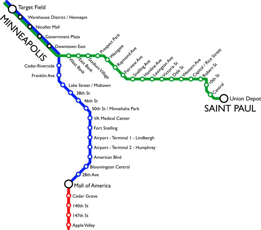
In the summer of 2014 Metro Transit opened the Green Line, a light rail line that connects downtown St. Paul and downtown Minneapolis.
Shortly after, in August, a woman was struck by a train as she attempted to cross the tracks at Westgate Station. This incident prompted her father to find out why she did not see the train, and led him to the UMN Human Factors department. As part of our Service Design class, my team investigated what impacts pedestrian and rider safety around light rail trains on the Green Line.
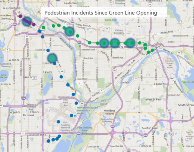
We saw that some stations had a higher rate of incidents than the other two station types based on Metro Transit data.
It turns out that the stations occur in three designs: stations that share a center platform, that have two facing platforms, and those split across an intersection.
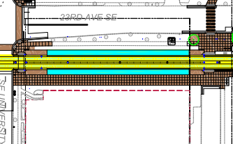
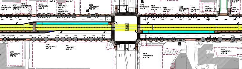
The stations with higher incident rates are all split stations, and the physical design of these stations directly impact rider decisions. This is due to the way the rider is led to access the station.
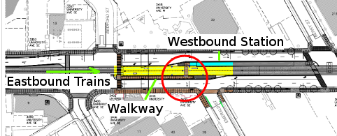
A long access ramp leads towards the station, facing the station and the oncoming train they want to catch. However, the opposite-bound train is approaching from behind them, and as they turn to cross the tracks there is no incentive or design feature that makes them look over their shoulder for the other train.
As we traced the user’s journey through the light rail system, we identified gaps in effectiveness of the system to deliver on the expectations of users. We grouped these gaps and assigned a severity, and brainstormed recommendations to improve the factors that impact rider safety. A selection of those issues are discussed here.
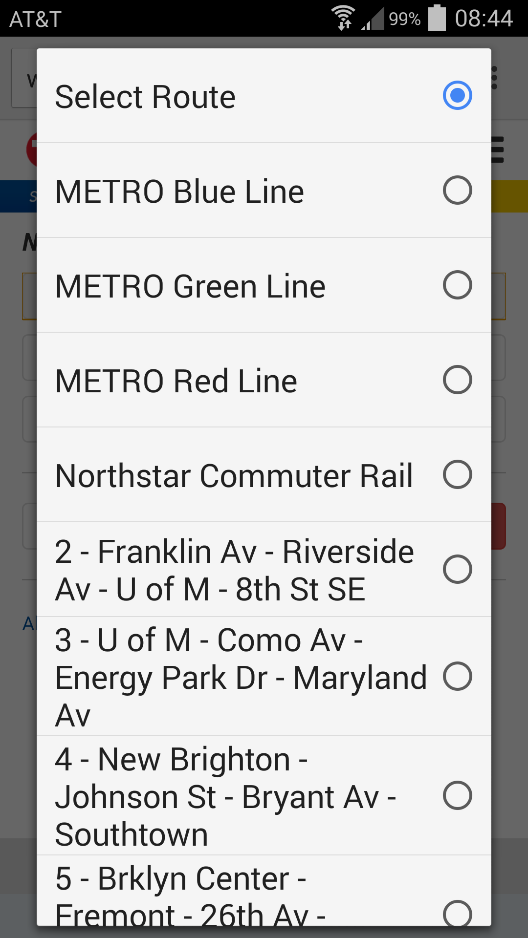
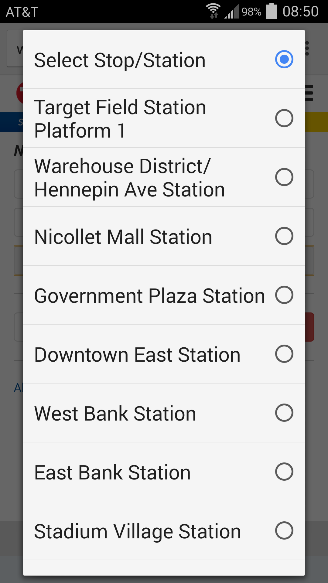
Transit options: mobile access
Metro transit has an online trip planning app that requires users to input the route, direction, and station in order to see when the next train or bus will be arriving at that location.
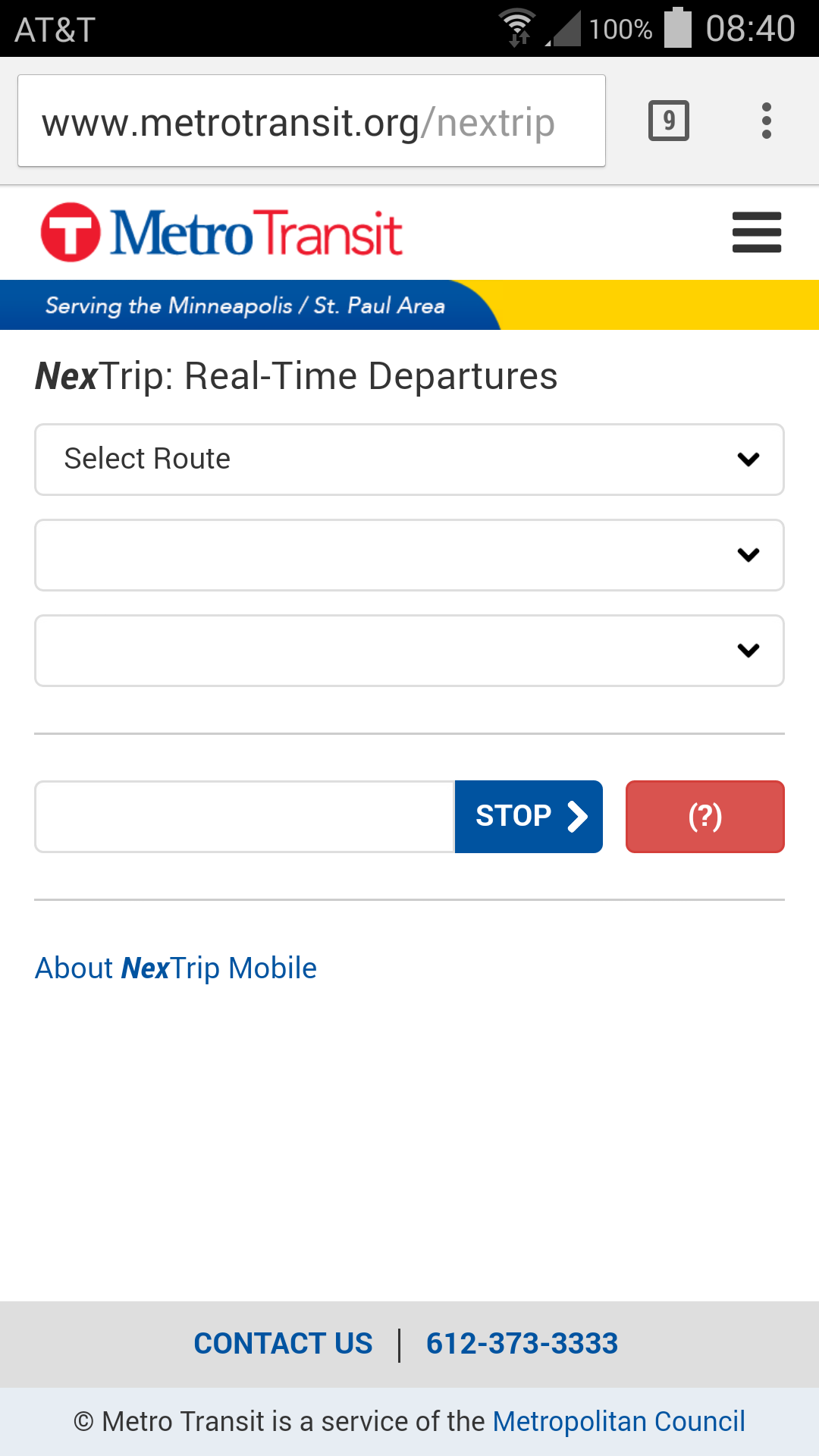

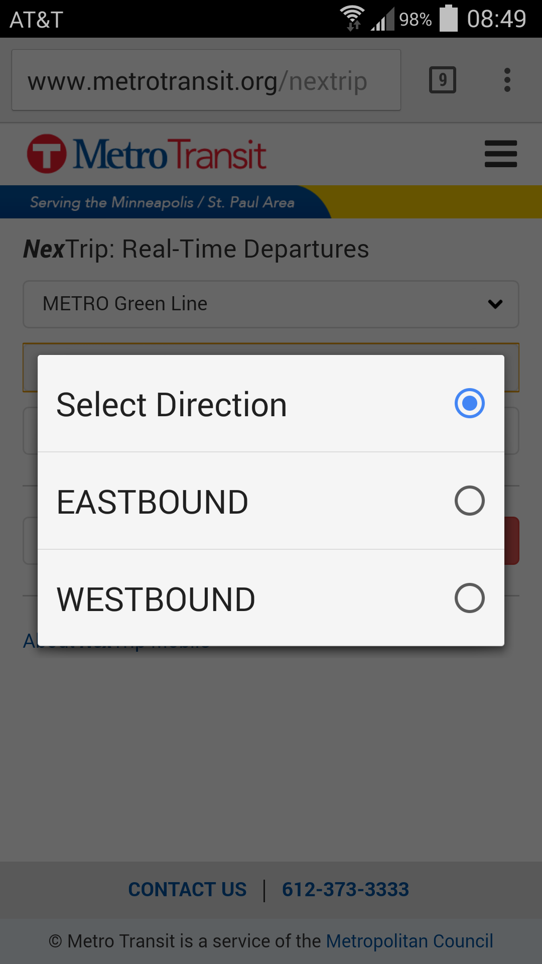
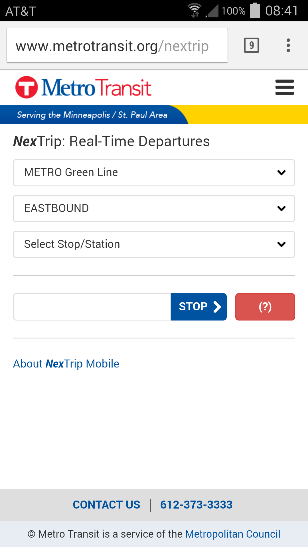
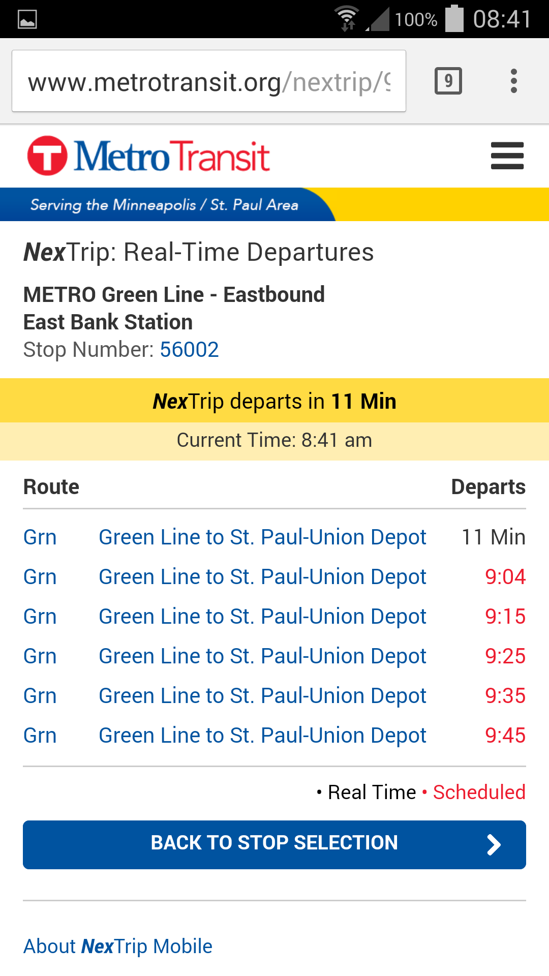
Since this is relevant information when riders are accessing the stations, navigating to the next departure times takes up attention that could otherwise be focused on the traffic around the rider. This long sequence of actions increases the chance that the rider will be looking down at their phone trying to see how much time they have until the next train rather than paying attention to their environment, and so we designed an alternate interface.
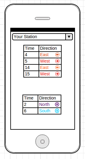
The redesigned app would use the phone’s GPS to select the nearest station automatically, since riders typically use this app when they are about to catch a train. In the case where they are planning a trip, they can pull down the menu and select the desired station. This also displays every approaching departure time, rather than asking the user to pick a direction. This eliminates the extra screens and selections used previously and provides all the information the rider needs on the first page of the app.
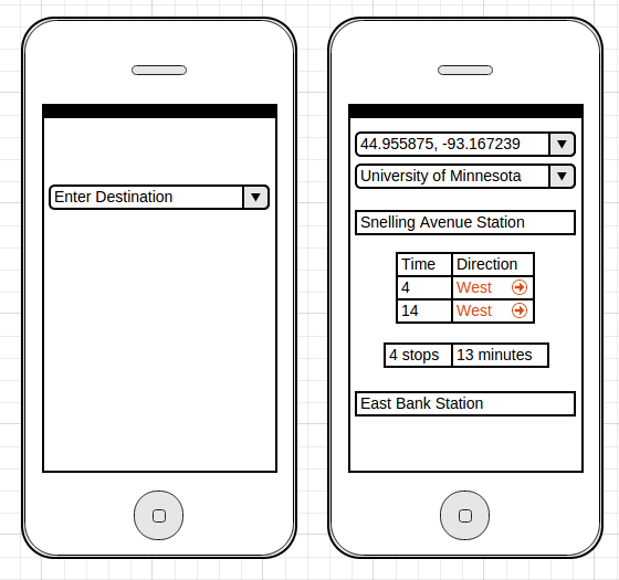
For the case where a rider is using the app to plan a trip by destination, we can give them the option to input where they would like to go and then use the phone’s GPS to find the nearest station and the route that will get them there, rather than asking them to select from a list. The second screen tells them when the next trains at the nearest station are departing, how long they will have to ride, and where to get off after only one interaction.
The idea behind this redesign is to make it faster and simpler for riders to find the information they need about next train departures so that they are not distracted by their phones while accessing the stations and crossing roads and tracks.
Platform Information: provide riders with better information
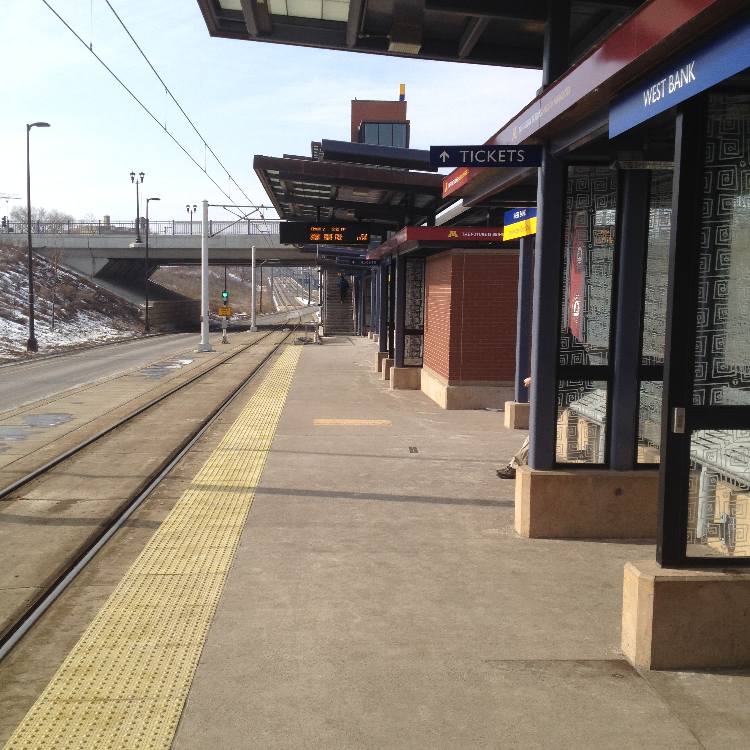
When riders are traveling to or on the platform, a critical piece of information is the next train departure time. Even on the platforms, the display showing those times can be difficult to locate and read (Hint: it’s the black sign with orange lettering in the center).
We observed riders making dangerous decisions like crossing busy intersections against the light in order to reach the platform, and it appears that this is because they don’t know when the train is going to arrive and they don’t want to miss it. This places an incredible amount of pressure on the rider to reach the station quickly, and they are not given the information that might help them make a safer decision. To alleviate this pressure, we suggested making train departure times visible from 300 feet away, or from the opposite street corner for most stations.
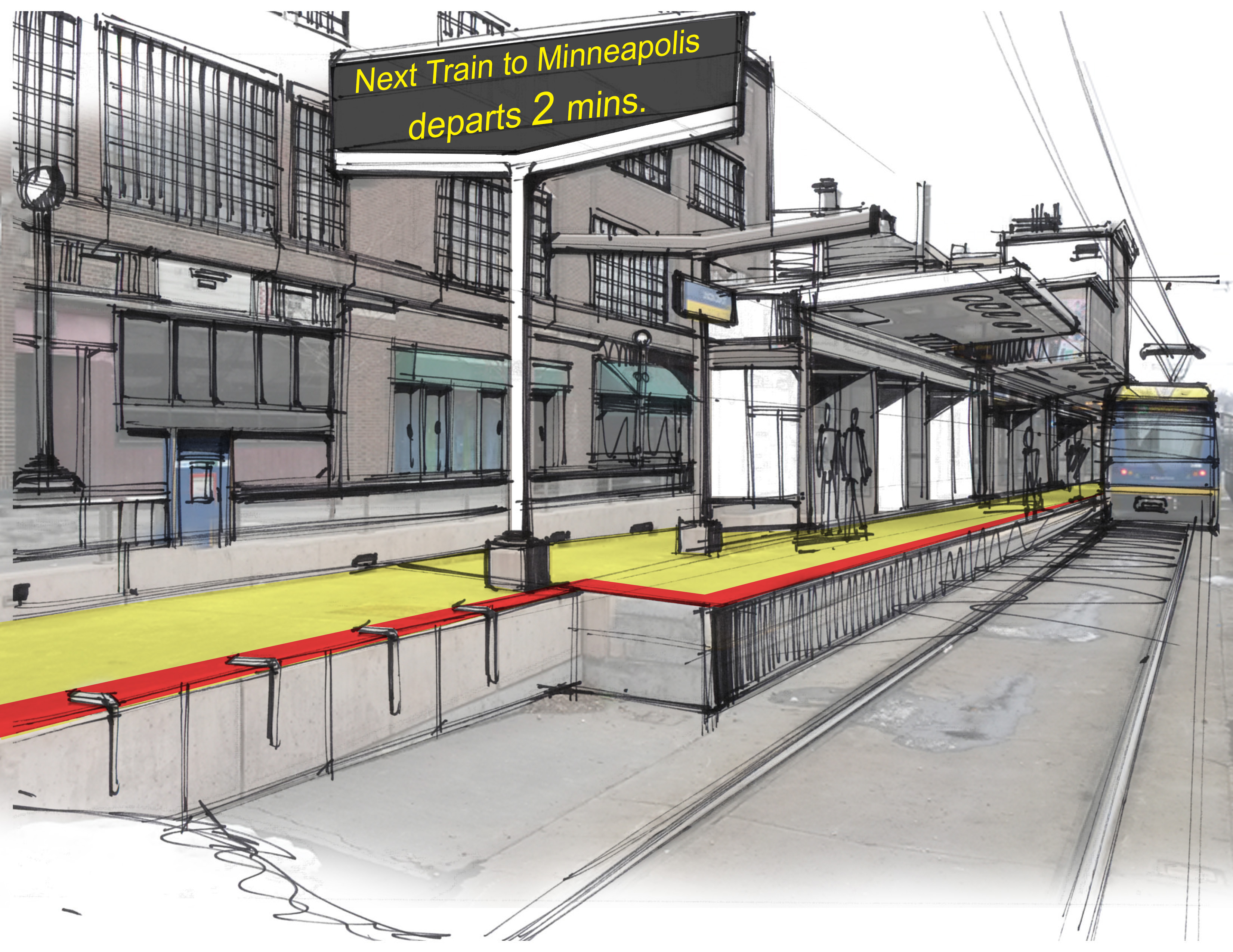
This display would be highly visible, and would allow riders to know when they have ample time to wait for the lights to change and cross the street safely. There are some problems with this, since if the sign shows “1 minute” riders may still cross against the light, but displaying “next train due” or a similar message 2 minutes before the train’s arrival may help to alleviate this problem while still providing information.
Crossing the rail: channeling attention towards trains
This is the issue discussed earlier with the long walkways that channel riders’ attention towards the station they are trying to reach and the train they need to catch that is moving towards them, and away from the train coming up behind them in the opposite direction. These long walkways were meant to guide riders to cross the street at a light to access the stations and reduce jaywalking. However, because the rider is already focused on reaching their platform and not concerned about the opposite-bound train, it is easy to visually fixate on the station and focus on watching for their train rather than staying aware of the second train. One method to help riders become aware of any oncoming trains is to change the environment so that they must physically turn back in the other direction through the use of z-crossings or swing gates.
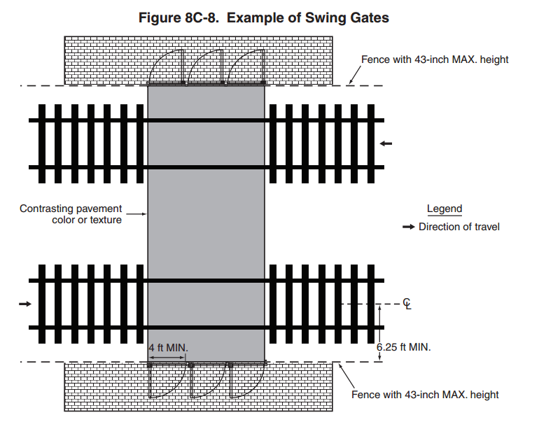
Swing gates force users to open the gate against their direction of travel, and in doing so turn towards a train approaching behind them. These gates are in use in light rail systems in California, and they are highly effective at reducing second-train accidents. A z-crossing has the same effect with more accessibility: as users navigate the barriers, they turn and walk in the other direction, allowing for the chance to see the second train.
Crossing the rail: highlighting recommended routes
A second issue with the long walkways is that they sometimes contradict the user goal of reaching the station as soon as possible. A rider can be directly across the street from the station, but the recommended route is to walk a block to reach the light, cross, and then walk that block in the opposite direction to reach the station - even though they could just cross the street, hop the barrier and get to the station faster.
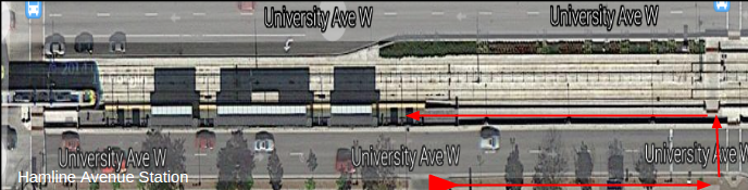
During observation, we saw footprints in the snow that indicated riders were jaywalking and climbing the barrier to avoid that long and redundant walk.
In order to improve rider safety, their goals need to be identified and integrated into the system. This could be done by highlighting recommended routes using color,
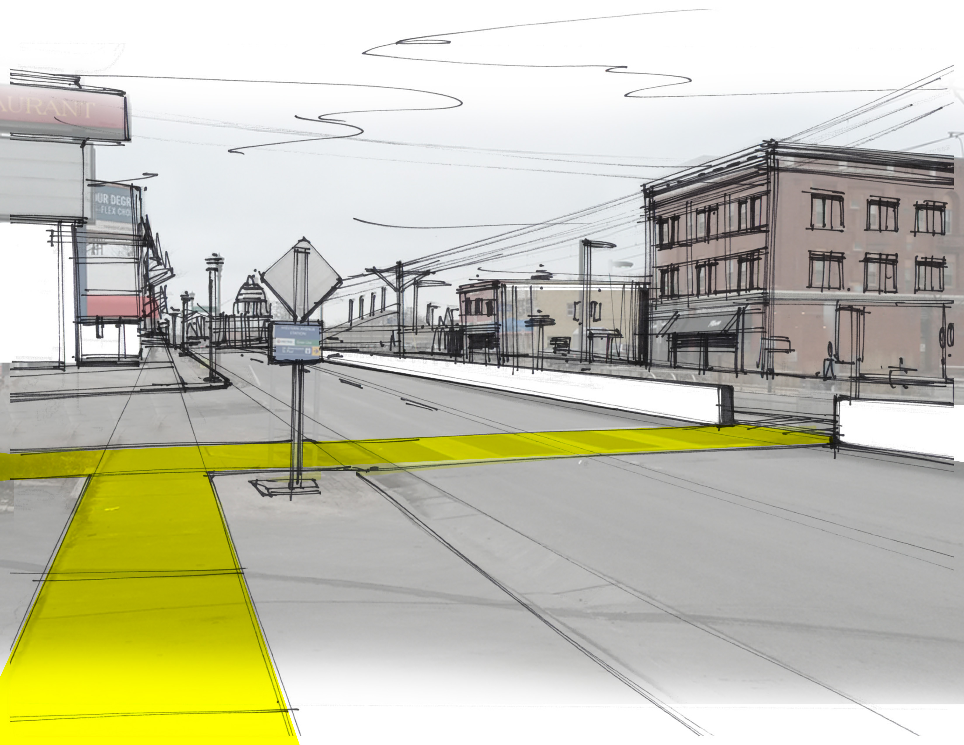
or by creating access points where riders actually use them
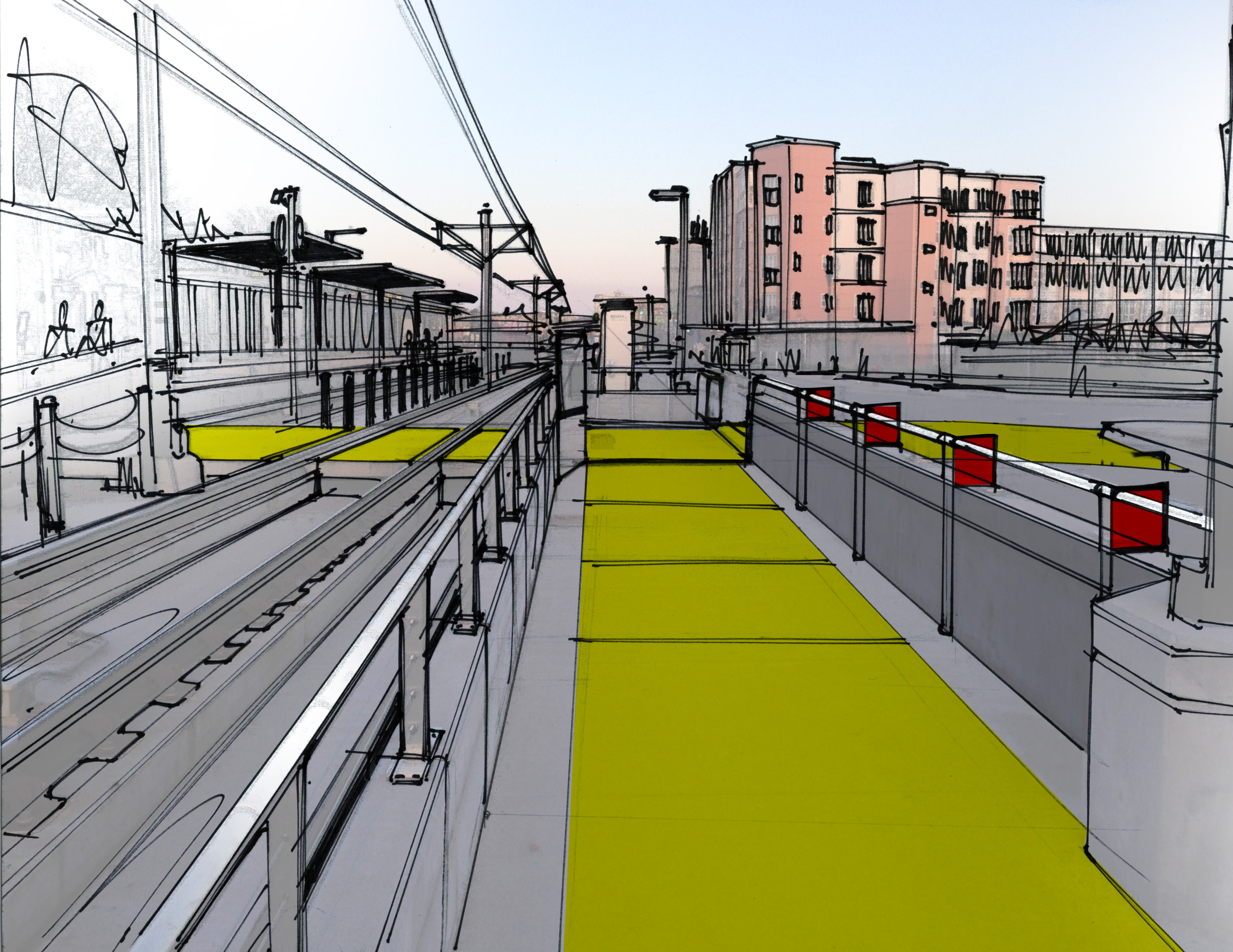
in order to reduce unsafe behaviors like climbing barriers. In combination with other environmental designs like swing gates, an environment that encourages safety could guide the users to their destinations.
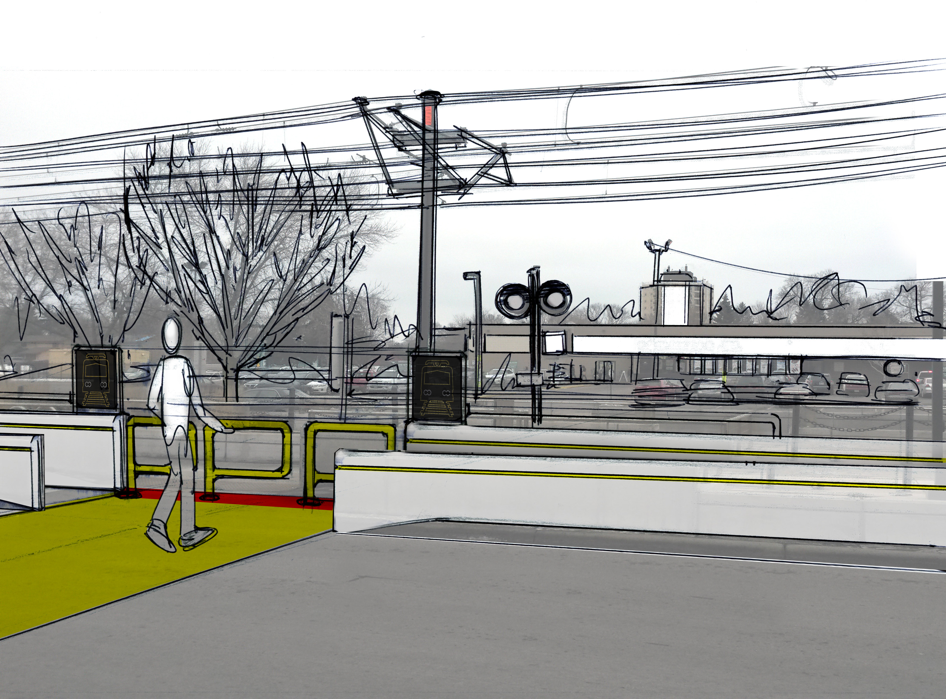
Crossing the rail: warnings
Pedestrian walkways often cross both sets of tracks to allow access to stations, and the warnings in place at those stations need to inform riders and pedestrians what they need to watch out for and the actions they need to take. Currently there is a rail crossing bell, a “Look” sign, a train symbol and a sign representing two trains approaching.
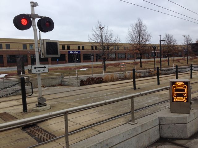
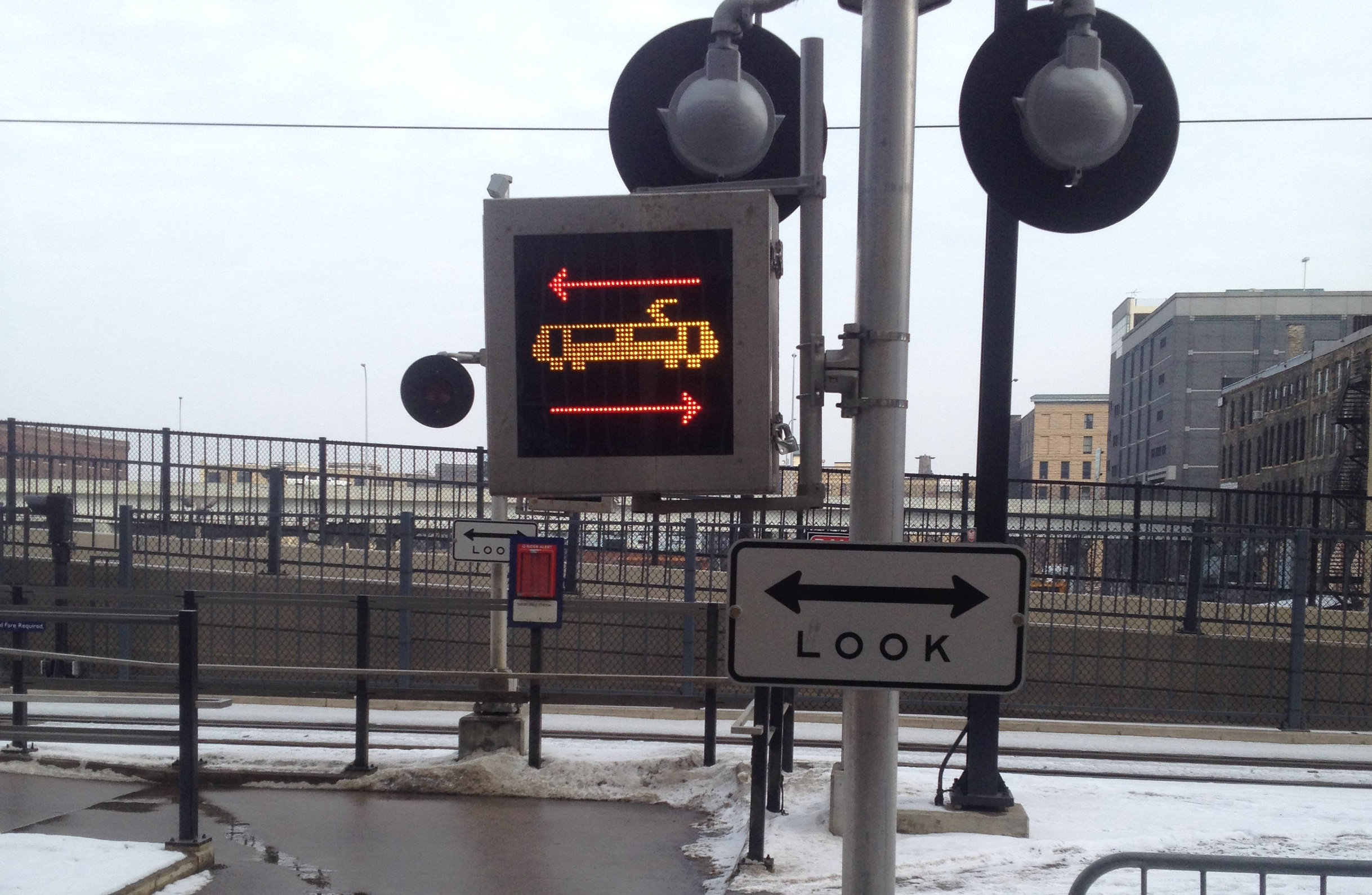
There is also a sign telling pedestrians not to walk on the tracks, and to instead follow the walkway.
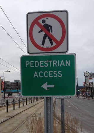
These signs are not clear to all riders, and it is possible to help them better understand the actions that they need to take when approaching the track crossing. One method is to warn them using the train icon, but then to specifically tell them to look both ways.
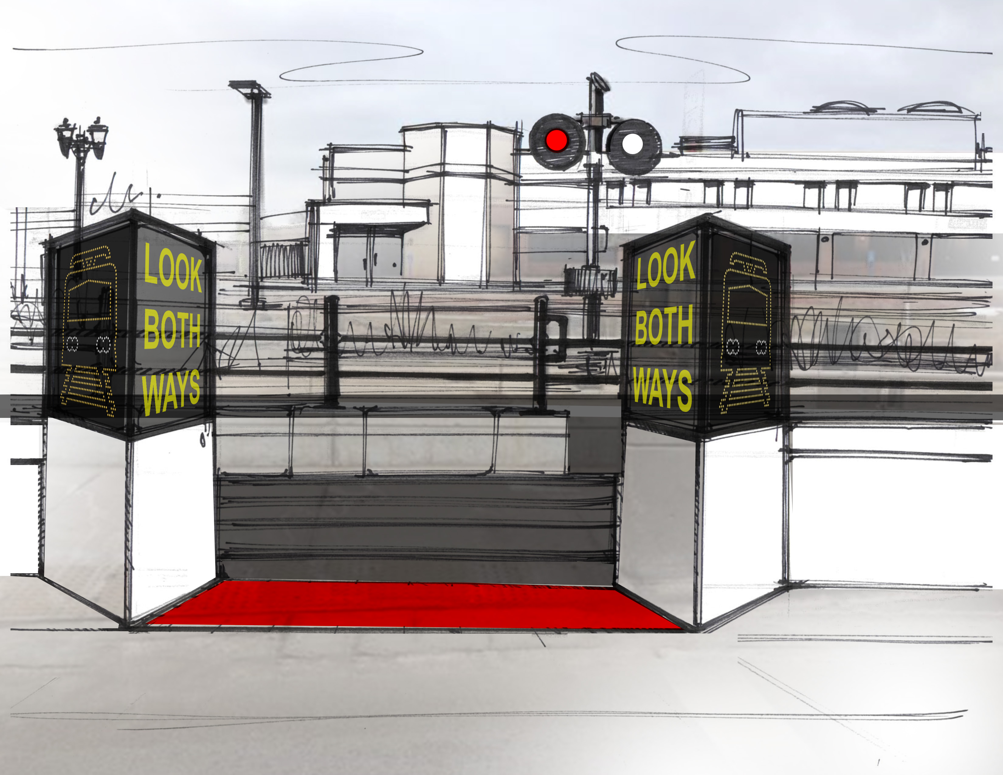
This strategy is intended to make the warnings understandable and relevant to a wider audience, capture their attention at the relevant time, and give them clear actions to perform in order to increase safety.
Train warnings: auditory consistency
Another aspect of warnings targeted at riders is the auditory warnings produced by the trains. Along with the auditory warning of the rail crossing bells, the trains have a bell and a horn. The bell is used whenever the train begins moving and when the train approaches an intersection, and the horn is used at the driver’s discretion, usually when they are approaching an intersection and when they feel a rider may be unaware of the train. Shortly after the conclusion of our project, we observed that the usage of these auditory warnings became much more standardized, allowing pedestrians and riders to learn what they mean. This consistency allows riders to rely on train auditory signals as a useful warning in the environment.
Conclusion
Our complete user journey included 64 steps, with 19 of those steps representing a gap ranked 6 or 7 on a scale of severity from 1 (low) to 7 (high). We attempted to provide ideas and recommendations that could alleviate or reduce the severity of the gaps we identified during the process. We had the opportunity to present to two members of the Metropolitan Council, parent organization of Metro Transit. We submitted a final report and presentation for the class that was not published externally.
I would like to thank my team members, Brian Fitch and Ryan McCoy, for their enormous contributions to this project. The recommendation sketches in this description belong to Ryan McCoy.