This weekend’s adventure was getting a Mac and learning to use Sketch! It was neat to find that my familiarity with GIMP and Moqups actually transfers pretty well to this new tool, although I will say that Sketch has an incredible user interface, with lots of accelerators that are easy to pick up as I go along.
My first thought was to go find tutorials, and I stumbled across this tutorial by Daniel Schwarz to make an icon featuring a moon. This was my first real dive into to using vector graphics to create an image; previously I have used Illustrator to create files for laser cutting. The tutorial also contained a link to an amazing Sketch plugin called Aeiconizer. This is a wonderful utility to have - you create a base icon, and it automatically scales your icon to all of the required sizes!
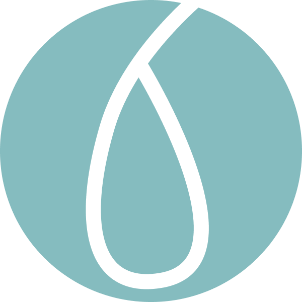
After making the moon icon in the tutorial, I decided to try my hand at an icon for a notification app. The name of the LLC that “owns” these endeavours is “Siphono”, after siphonophores, which are colonies of organisms that appear to be a single organism. The most well-known is the Portuguese Man o’ War, which isn’t a jellyfish, despite all appearances. I searched around a bit for inspiration, and the Monterey Bay Aquarium Research Institute posted this image of a rare jelly, Vampyrocrossota childressi (I know, it isn’t a siphonophore, but I didn’t realize that until later!) that got me inspired! So I started brainstorming and sketching out some ideas. Here are the first two.
![]()
![]()
There were some things I liked about each of them, and some that I didn’t. For example, I liked the shadow and interior-shadow effects and how they made the jelly appear to glow, but I didn’t like how prominent the tentacles are on both icons. From here, I could either change the tentacles or the layout, and what helped me decide was seeing the icons smaller, at the size that would be used as a thumbnail or on a phone.
I really felt that the design was too complicated to be conveyed properly at a smaller size, so I wanted to try keeping the feeling of the image the same, particularly the glow, but more adaptable to a range of sizes. I iterated on both icons, ending up with these ideas.
![]()
![]()
![]()
At this point I definitely preferred the third icon, because I felt that it clearly conveyed the idea of a notification or alert being a core part of the app, and it captured the glow of the jelly that I wanted to maintain. Of the other two, the first felt too elongated and both felt incomplete; it could be that the style of the exclamation point does not match the delicate glow of the jelly. A further variation could be to have the exclamation point echo the style of the lines and shadows in the jelly rather than being filled in. Either way, I felt that the third option was what I wanted to move forward with, so I ran the Aeiconizer plugin!
Armed with icons in all the sizes needed for the app store and phones, it didn’t take long until I could see my icon in the wild.
As an additional adventure, I created an image for the splash screen of the app, continuing with the siphonophore theme.

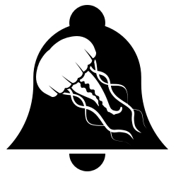
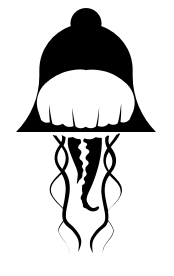
I did find many good tutorials and resources for learning to use Sketch and creating apps, and after reading through this one by Param Aggarwal I searched through the icons available on the Noun Project. I found two icons to play with, a notification bell by Travis Avery and a jellyfish by parkjisun.
The basic idea from Param’s tutorial is to find a few icons that embody the idea of your startup or go with keywords that describe your startup and start combining them into logos until something interesting comes up. I came up with some initial ideas;
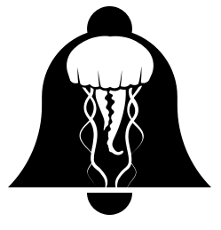
and then I was inspired by the ability to break the jellyfish across the bottom line of the bell and the ensuing combination of the bottom of the notification bell and the bell of the jellyfish, and ended up with some more creative ones.


Overall I think that if I had stumbled across the tutorials in the opposite order I would have had the chance to play with icon ideas more freely, but I wouldn’t have gotten as much in-depth experience with Sketch’s interface and creating an image with vector graphics. The Noun Project is a fantastic resource for building a logo and getting ideas, and I’m pretty pleased with how quickly I was able to move into more abstract and interesting logos after finding just two keyword-based images.