
The Minneapolis skyway system boasts of being the longest continuous system in the world, at 11 miles of skyway spanning 80 city blocks (Thanks, MentalFloss.) Visitors always seem thrilled at the complexity of the system, but the regulars - downtown office workers and shoppers - can find not only an escape from the -3°F windchill but also shops, restaurants and coffee during the workday.
But how do you learn your way around the system? If you’re as lucky as me, you meet a coworker known as the “skyway master” who is willing to lead you to their favorite places. If not, you can wander and sometimes get where you were hoping to go, often wishing for more skyway maps posted around.
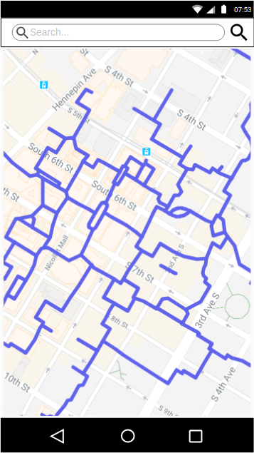
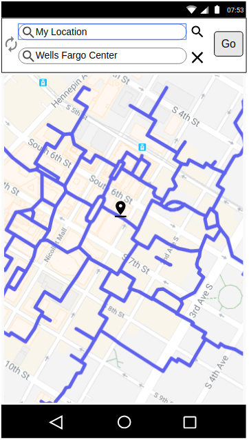
There is an online resource, http://www.skywaymyway.com/, and it’s pretty good as far as it goes. It lets you search by name, browse by category and get directions.
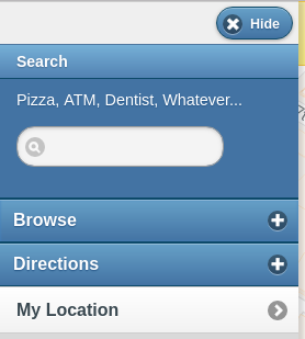
Skywaymyway lets you search for a destination by name
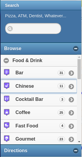
You can browse by category,
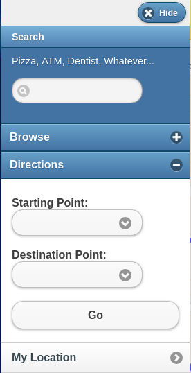
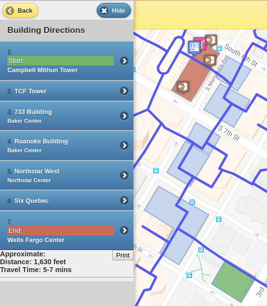
or get directions from one building to another.
However, one of the first quirks I realized was that my mental map of the skyways was completely separate from my mental map of the streets of Minneapolis. Second, the skyways don’t have to follow a grid like the streets so it’s easy to get turned around inside a building, take the wrong turn in a branching hallway or confidently head the wrong direction.
What I wished for on my first few solo adventures into the tangle of skyways was directions that would help me stay oriented. Building-by-building directions aren’t bad, as long as you don’t get turned around.
Even with the existing signage, I would routinely go into the wrong building and then need to re-orient myself and backtrack to get back on the right path - and I don’t think I’m alone in this struggle.
Users
There are several interesting things about the population that uses the skyway. Frequent skyway users quickly become familiar enough to take their everyday paths to work or to a favorite lunch spot, and so become intermediate users. Rarely do they become experts, because there is very little pressure to do so. Once several useful routes are known, veteran skyway users have limited knowledge of the rest of the system. GPS doesn’t work very well in the skyway system because of the buildings and the irregular pathways, so it isn’t as reliable of a tool.
The goals of most skyway users are fairly simple: find a location, get directions, and easily navigate to their destination. Two common use cases are downtown business people traveling between transit, their office building and restaurants or shops and infrequent skyway users exploring or after a specific destination.
Design
The goals of this design sprint are to create an app that addresses the three goals and two main user groups. A good user experience in this context is almost invisible: everyone gets to where they wanted to go.
The basic idea is to create an app that feels like Google Maps but built specifically for the skyways, and uses landmarks to help users stay oriented. There is some signage in the skyway system that users can rely on, given context. Restaurants and shops make good landmarks for the skyway system because users can easily translate “away from Caribou Coffee” into a direction, without needing to reference cardinal or street directions.
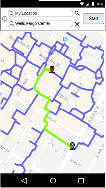
Once a destination is entered, a route can be suggested and laid out. As users become more familiar with the skyways and their path, they can use the route alone to guide them.
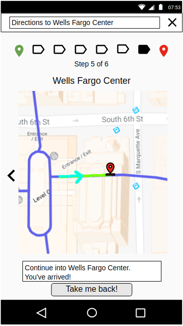
Specific directions can guide the user through the buildings along their path through a card-like interface, with each building occupying a card that includes relevant landmarks and direction of travel. Users can swipe through the cards or use arrows, and are given both visual indicators of landmarks and written directions through each building.
These are the direction cards from Campbell Mithun Tower to Wells Fargo Center on the route higlighted in green above.
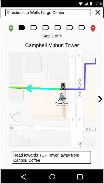
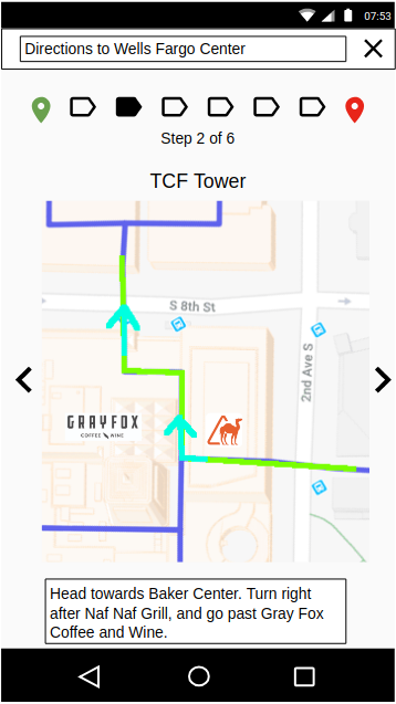
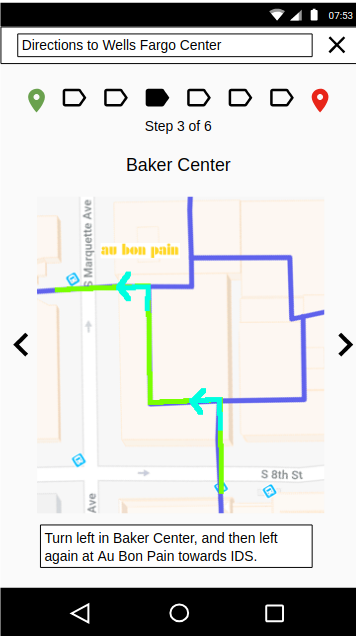
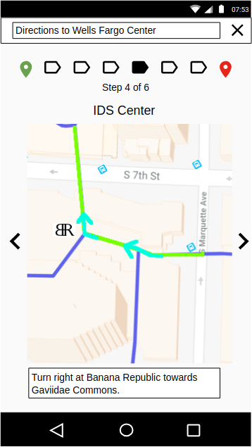
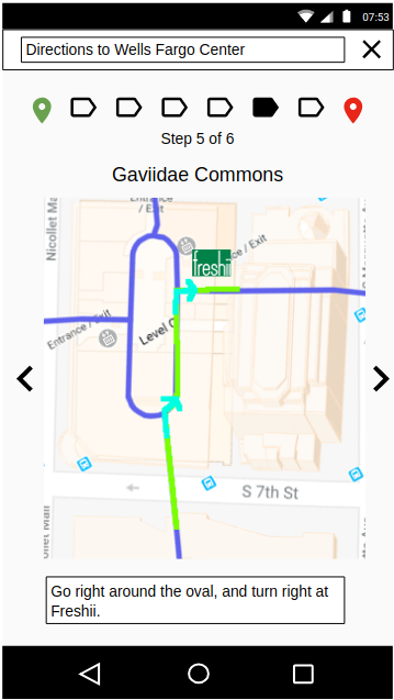
The idea behind this approach is that it is difficult to determine where inside a building you are, but easy to look around and identify restaurants and landmarks, and then choose a direction based on the paths available and the landmark orientation. Buildings are labeled with signs, and crossing over a street into another building is a distinct enough transition to cue the transition between cards. Users have the option of going back a card if necessary, and the skyway map is only overlaid by the route to preserve context.
The last step is targeted at users who are on an out-and-back trip, such as office workers going out for lunch or shoppers heading to a particular store from their parking spot. Immediately upon reaching the destination, the app offers up the next logical action - returning the way they came.
Evaluation
Leveraging existing user familiarity with Google Maps makes the learning curve for this app relatively low, and it aligns very closely with the three user goals I identified. It’s a fairly simple interface targeted at new skyway users.
However, to accommodate change and the inherent instability of using restaurants and shops as landmarks, the app might also need an interface for updating landmarks and reporting changes or errors. Empowering skyway users to improve the information available is a convenient and powerful way to make the app relevant.
Extenstions
Besides an update system, it would also be neat to consider a few more feature extensions to this app idea. One would be to allow users to add photos of skyway intersections from different angles, and make those available during navigation to help guide users through particularly confusing paths. Using GPS as much as possible is another option, since it can give a rough idea and help keep the card changes in sync with actual user location. Lastly, being able to let business owners add or update their businesses enriches the experience. Not only do they become available as a destination, but they can also add photos and become a landmark, which improves the user experience. Becoming a landmark benefits both the users of the app and the business, because being a fixture means that your name and location are being shared.